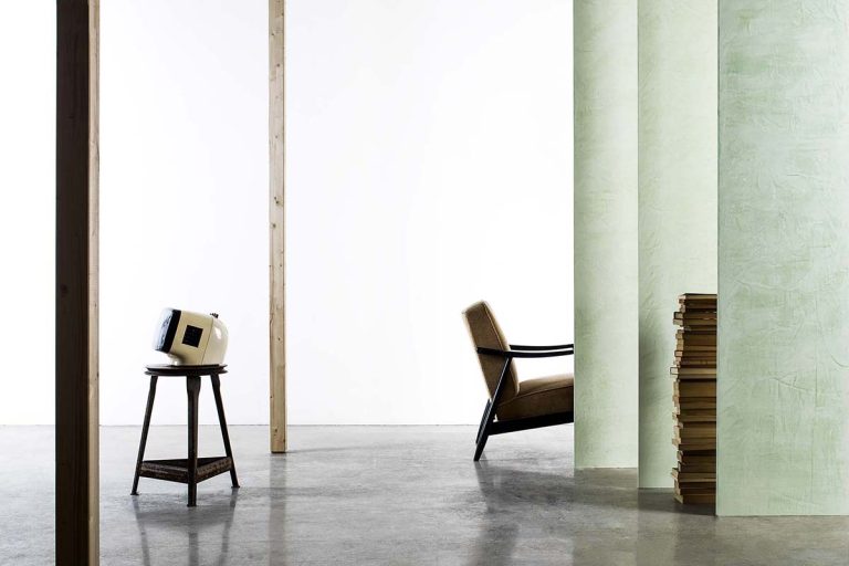
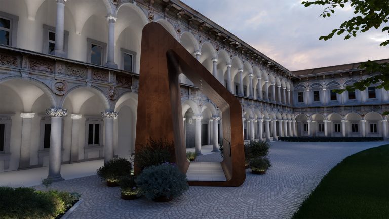
Colour choices not only influence the everyday well-being of those who inhabit a space but also impact the way they visually perceive it. Colour can subtly adjust spatial perceptions, easing architectural challenges: it has the power to alter a room’s shape and proportions.
This topic is especially relevant today, considering the number of people who spend a large part of their day in indoor environments! In these cases, colour can prove a powerful ally.
For instance, neutral or pastel shades can make a room appear more spacious. Darker tones, on the other hand, or dramatic accent walls add depth. Additionally, tactile and textured finishes can enrich the space, giving the room a warm, enveloping feel and added dimension.
Curious to know more? Join us for insights with Leonardo Pelagatti, our colour expert, head of the Color Design Center at Cromology Italia, coordinator of the group’s colorimetry division and member of its tinting systems centre of excellence. Guided by his expertise, we’ll discover valuable secrets for shaping space using simply colour.

Light and neutral colours for a visually expansive effect
Light, neutral or cool colours, such as white, for example, are perfect for amplifying spaces, since they reflect the light and make rooms appear larger.
To this end, Viero Decoratives offers a truly outstanding option through its unique metallic decorative paint,Silk.
“One of the greatest advantages of Viero Decoratives products,” explains Pelagatti, “is the subtle variation and modular nature of the colour. This creates vibrant and dynamic surfaces, thanks to a play of light and shade that adds depth, making spaces more visually engaging. The changing effect of SILK enhances light reflection, and lighter colours from the SILK colour chart – like WHITE or SKB8 or SKB4 – help create inviting atmospheres, making the room feel more spacious and bright.”
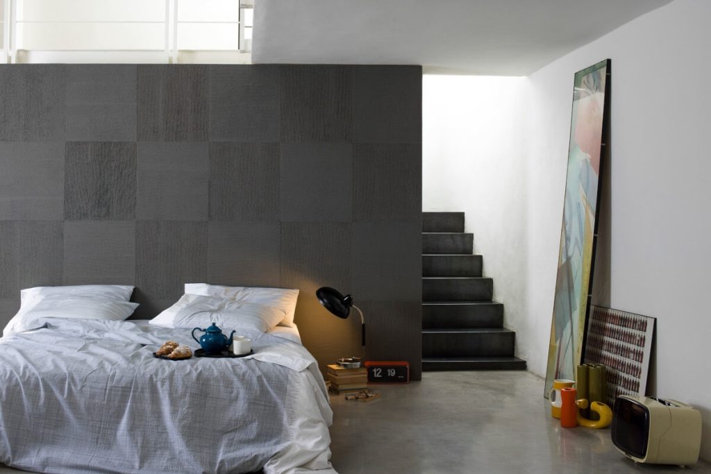
Dark walls for cosy, sophisticated and compact atmospheres
Darker colours, on the other hand, absorb most light, making the space feel more compact and intimate.
“This shouldn’t be seen as a downside, to the contrary. Dark tones help create cosy areas within larger, open spaces. They’re perfect for places meant for conversation, reading or concentration… As with lighter tones,” continues Pelagatti, “the textured or matte effect of the product enhances the final look. For instance, the sand product GHIBLI in colours GH115 or GH130 or GH132 works perfectly in achieving this effect. Balancing the room’s overall colour scheme is crucial. Pairing these rich tones with lighter or mid-range shades is advisable to draw the focus and emphasise the intensity of the chosen colour.”
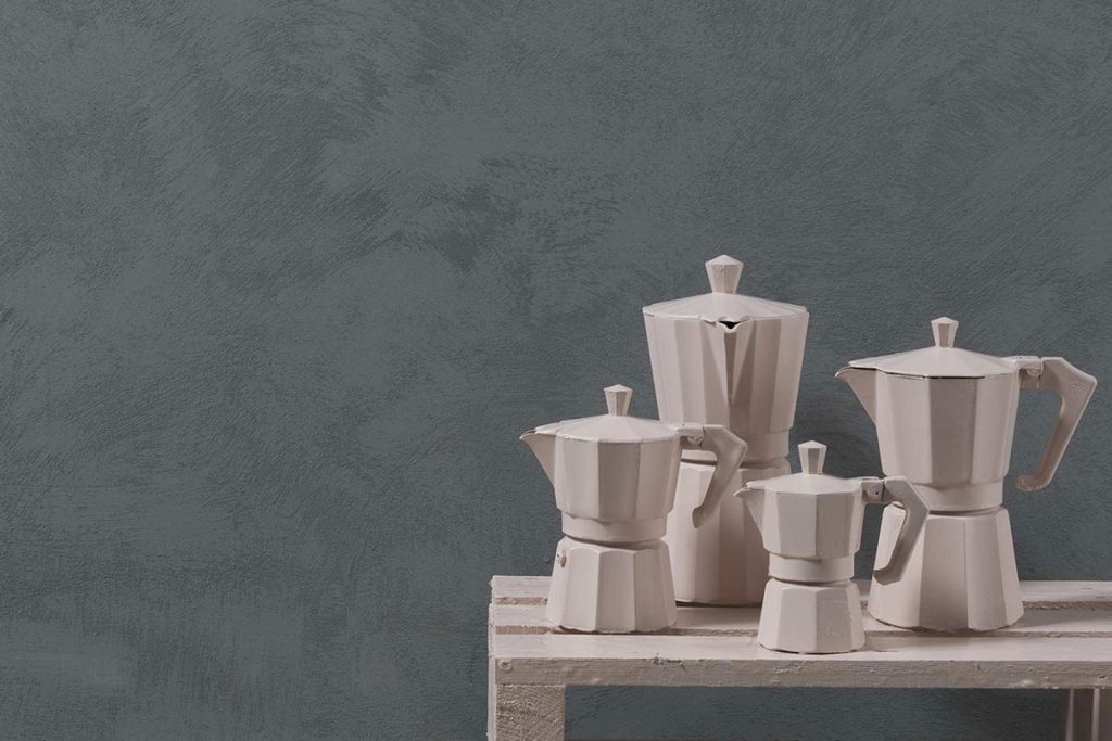
How to change the perspective through colour placement
By playing with wall colours, it’s possible to visually minimise certain architectural challenges, such as a room that’s too tall (or too low), a space that’s too narrow, or perhaps one that feels overly vast. So, how can this be done? Here are some handy tips to keep in mind before planning.
- There are no wrong colours. The key is in using them correctly! In old design manuals, the advice was to create a “perfect” room with a light or very light ceiling, mid-tone walls, and a darker floor. However, these rules are less commonly followed today: any colour can be used, provided it’s applied thoughtfully.
- Ceilings? Tips for shaping them with colour. A dark ceiling, for example, paired with light walls can make a room feel lower, whereas a light ceiling with medium-light walls gives the impression of a taller room. In both cases, perspective illusions can be created by extending the ceiling colour at least 20 cm down onto the top of the walls: a trick that deceives the brain and alters space perception.
- Avoiding the tunnel effect in long, narrow corridors. Another common issue is the “tunnel” effect in long, narrow corridors. In these cases, strategic use of colours and decorative elements can make a real difference. Painting the far wall in a darker or contrasting colour to the side walls disrupts the perception of length. Adding mirrors or artwork to one wall creates an optical effect of greater width, while segmented lighting along the corridor helps avoid a “tunnel” feel. Finally, line orientation is key: vertical stripes on walls tend to visually “lift” the space, while horizontal stripes give a sense of greater width, offering multiple ways to optimise the appearance of spaces and visually correct proportions.
Matte or gloss? The importance of the finish
The choice between a matte and gloss finish goes beyond aesthetics and influences spatial perception.
“Matte finishes,” explains Pelagatti, “reflect little light, creating a soft effect that enhances the colour without glare, making it ideal for cosy spaces like bedrooms and living rooms. It also hides small imperfections, making it perfect for walls that aren’t entirely smooth. Gloss finishes, on the other hand, reflect a lot of light, adding brightness and vibrancy. This makes them ideal for visually enlarging small or dimly lit spaces. However, they also highlight any imperfections, so are best suited to smooth surfaces and modern spaces like kitchens and bathrooms.”
Be mindful when using intense colours, as these can be visually overwhelming on large surfaces.
Among the various options, Viero Decorative offers ALLURE, a pearlescent sand coating that is both glossy and matte. “In colours ALA39, ALA7, and ALA18, it’s like a soft embrace. If we opt for AlO6, ALA34 or ALA49, it becomes sharp and striking.”
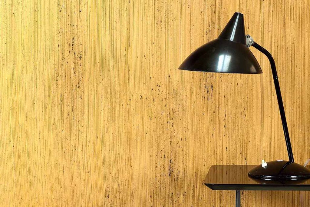
Enveloping, three-dimensional spaces with textured finishes
Tactile and visual patterns work hand in hand with colour, enhancing the impact or emotion a wall finish seeks to create in a room.
“Apart from traditional decorative products, over the years we’ve focused on solutions with greater thickness, where the applied effect creates a striking play of light and shade. Examples like the Corduroy effect, with its ribbed texture, the Stone effect, which makes the wall resemble stone, and the Wood effect, reminiscent of wood, not only enrich spaces visually but also create an almost tactile sensation; it’s hard to look at this kind of wall without wanting to touch it. With these thick coatings, it’s possible to amplify all the optical illusions mentioned earlier.”
Another aspect worth considering? “It is essential,” Pelagatti continues, “to note that these contrasts of light and shade need the right lighting to enhance the textures and bring out the three-dimensional effects. Without proper lighting, the visual impact may be compromised. Moreover, to suit different design needs, it’s possible to choose from more de-saturated tones, in line with current colour trends, or vibrant shades like coral PLA34 or golden yellow PLA32, which are better suited to commercial spaces. These colour options offer versatility and can help create engaging, stimulating atmospheres in public and work environments.”
Step into the world of Viero Decoratives and discover the sophisticated union of material and colour
As you will have discovered in this article, Viero Decoratives research focuses intently on its finishes, creating colour palettes that perfectly match its decorative effects and textures to craft multisensory products that inspire emotion. If you enjoyed reading up on Leonardo Pelagatti’s tips, there’s another dedicated feature on the blog with more insights. Curious to learn more about the products and explore the world of Viero Decoratives? What are you waiting for? Subscribe to the newsletter to keep up to date or contact our team!

