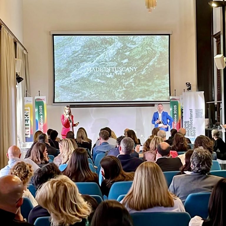
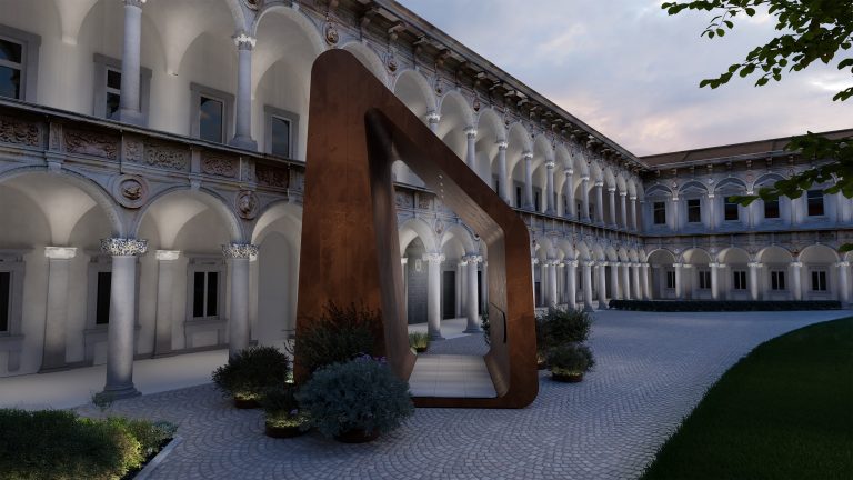
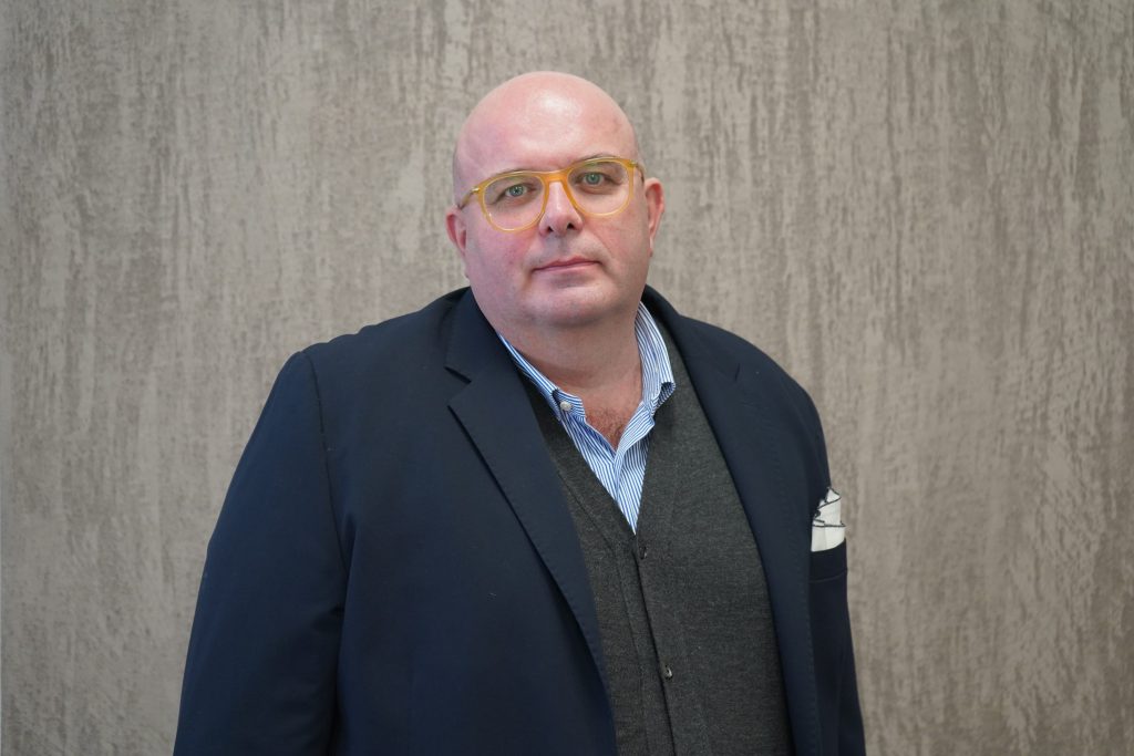
Leonardo Pelagatti is the head of the Colour Design Centre, coordinator of the colorimetry team, and member of the centre of excellence for tintometric systems of the Cromology group, which includes the Viero Decoratives brand. He’s been working in the field of colour for over 25 years, identifying its rules and processes, collaborating on the creation of tools such as colour charts and swatches, and providing colour consultancy to designers. We asked him for some valuable tips on creating aesthetic continuity between floor and wall, particularly by playing with two Viero Decoratives solutions united by two well-harmonised colour charts: the new decorative system OLTRE and our elegant lime-based products from the Marmorini line.
OLTRE, the refined solution to create a flow of creativity
Less is more? It’s still too much.
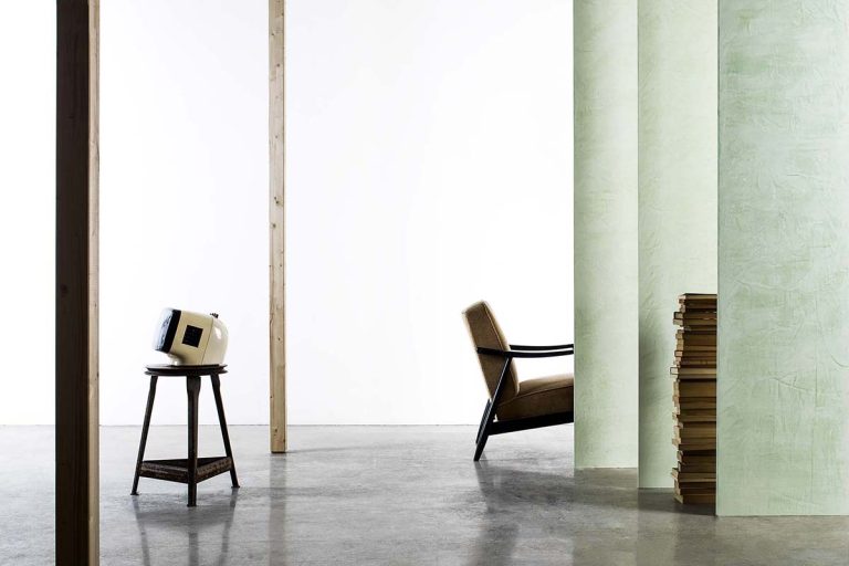
The new decorative system OLTRE is inspired by this radical philosophy, aiming to eliminate any aesthetic obstacles to the flow of vision. Whether it’s joints, skirting boards, junctures, tiles, parquet, or in general the classic boundary line between floor and wall, OLTRE becomes a furnishing element capable of creating atmosphere and shaping spaces. ‘OLTRE,’ Pelagatti explained, ‘fits into a hyper-minimalist architectural taste. With OLTRE, you go beyond the simple idea of removing elements to achieve tidy and clean environments. The concept behind the product is to introduce such a refined and selected finish that it allows the designer to take a highly minimalistic aesthetic approach, where no additional elements are needed: all it takes is to know how to choose and play with the environments. Basically, you witness the paradox of adding something that allows you in turn to eliminate everything else. OLTRE is designed to eliminate the floor and make it one with the walls and ceiling, almost creating a bubble. A natural extension that does not weigh down the space.’
In this sense, OLTRE allows you to design the space by working in two main directions: monochromatic or contrast. Let’s see how.
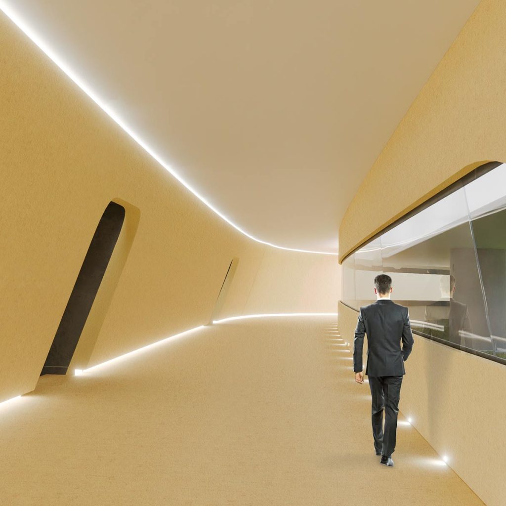
Monochromatic total look for an ethereal cloud effect
With OLTRE and Marmorini, you can work in monochromy, creating a global approach to colour intended as a unique and immersive element. ‘This solution,’ Pelagatti explained, ‘is particularly interesting when playing with large spaces and volumes. In this case, the final result is a very ethereal environment, similar to a bubble, where the visitors feel like they are floating. Also, the monochromatic solution allows you to give sensory softness and greater sinuosity to excessively orthogonal spaces with significant out-of-square elements.’
‘In this case,’ continued Pelagatti, ‘we can certainly work with warm beige tones, particularly sought after at this time. For example, a MAR 10 or a MAR 09. Sandy tones give spaces a relaxing effect, evoking the earth and nature. But MAR 23 and MAR 34 also work well, even the soft yellow shades like MAR 26. This way, the colour effect becomes truly enveloping.’
The element that requires particular attention? Obviously, lighting, which furnishes and contributes to designing the balance of the environment. ‘Lighting,’ Pelagatti underlined, ‘becomes really crucial in this case because it helps to highlight some areas or darken others. To enhance this particular decorative effect, grazing light effects and diffused lighting are undoubtedly interesting.’

Designing spaces freely with colour blocks
Another solution is to use colour as a strongly structuring and expressive element, capable of sculpting and delineating space with chromatic blocks that could even be in opposition, to create complementary harmonies. The result is a dynamic visual impact. ‘For example, with OLTRE, you could achieve this by using the entire range of dark colours on the floor, which are normally more difficult to apply to walls. Think of an STY06 or an STY12, particularly suitable for horizontal surfaces. You could then use contrasts to logically highlight some areas compared to others. I think, for example, of commercial spaces: shops, offices, restaurants… where, within the same venue, different colour areas can “logically” define different functional spaces without the need for walls or furniture.’
Finally, on the walls, depending on the desired final effect, you can apply OLTRE or lime-based Marmorini, whose colour chart has been designed in continuity to provide maximum creative expression freedom to designers.

Relaxing blue tones for environments that do not fear water
‘Given the hydrophobic nature of the OLTRE decorative system, resistant in humid environments like bathrooms, spas, pools, and wellness areas, it’s interesting to explore tones like STY 45 and STY 44: colours that evoke the freshness of the liquid element and aquatic nature. The stimulating aspect of applying coloured finish directly to the floor also involves tactile perception. You won’t get a perfectly smooth surface like you would with tiles, but by walking barefoot, you will be able to experience a sensation of colour freshness that will involve multiple senses.’

Colour, material, design. Discover more about the Viero Decoratives products
The world of Viero Decoratives is full of surprises, details, materials, colours, inspirations, and solutions, all waiting to be discovered. If you want to learn about other products, explore the various colour charts, request more in-depth information, or perhaps (if you are already a partner) try our products and various application techniques directly in Tuscany, visit other areas of the website and contact us. Together, we will find the best solutions for your needs and the spaces you are designing.

